
Langflow's onboarding: a usability test case study


Previously, I conducted a usability test focused on the homepage, docs and pricing — key elements that impact signups. This time, I want to focus on the onboarding experience, using usability testing to explore how to drive activation.
For this usability test, we will examine Langflow, a low-code platform for building LLM applications, designed to to be an interface on top of Langchain.
I invited Hanson, a developer who has experience building chatbots and prefers low code solutions to explore Langflow.
Disclaimer: The insights shared here come from one participant. While they are helpful, they should be considered part of a broader study with more participants. The goal is to demonstrate how usability testing can yield actionable insights for developer products.
Research Objective: Hypothetically, the team at Langflow is trying to understand how to drive activations. We’ll use a successful execution of an LLM pipeline as the activation metric.
Here’s some context to set the stage:
Persona: Developer proficient in Python who uses AI to automate personal projects and prefers low code solutions. Has experience with similar products but has never used Langflow.
Usability Task: You’re interested in building a chatbot and heard about Langflow. Your goal is to try to build a chatbot with it.
As a researcher, your goal is to gather data through observation, listening and asking questions in order to gauge how easily the participant can complete the task of running an LLM pipeline and, ultimately, building a chatbot.
Let’s dive into the research question: How easy or difficult is it to get started with Langflow and build a chatbot?
Hanson successfully built a chatbot using a starter template, which significantly reduced the time and effort required. Interestingly, he mentioned that without the starter template, it wouldn’t have been easy to complete within 30 minutes. I would run more usability tests with a scenario to use Langflow for a real project, rather than a demo/starter project.
He was impressed by the platform’s flexibility and customizability, finding it easy to edit the code of the components. He also appreciated that it’s open source. The biggest area of friction is finding Langflow’s starter templates and product after signup.
1. When product onboarding doesn't align with user expectations, it can cause confusion and delay activation.
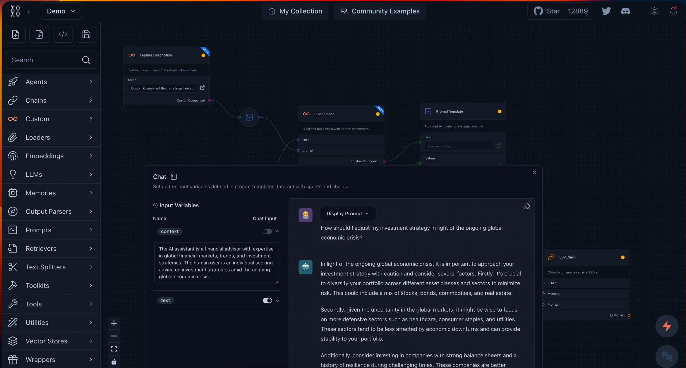
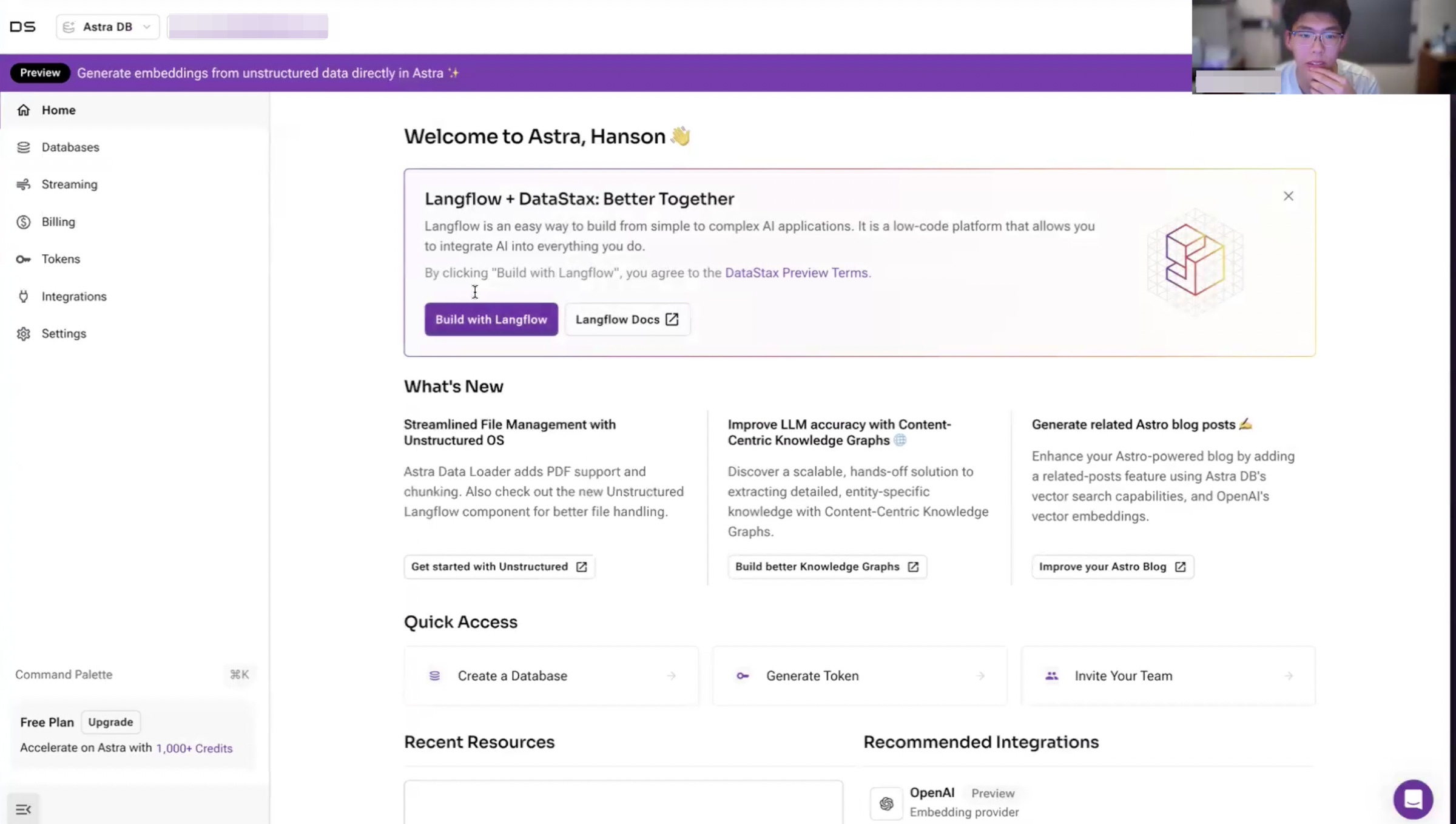
When Hanson visited the homepage (langflow.org), he saw a preview of the product (image 1). However, after signing up, he saw a completely different interface (image 2). It’s not just a matter of dark or light mode; he expected to land on the canvas where he can drag and drop components (image 1). This mismatch between the homepage expectations and the actual product dashboard caused confusion.
From my previous life in marketing, this inconsistency also applies to ads and landing pages — if the landing page content differs from the ad, it creates friction and reduces conversion rates.
This discrepancy between the homepage and onboarding is likely due to Langflow's recent acquisition by Datastax and their efforts to integrate it with their managed serverless database, AstraDB. While using AstraDB may be beneficial for developers who are also using Langflow, it might cause confusion if they did not start out looking for a database. Presenting many options, particularly ones that are not relevant after signup, will cause friction. Additionally, the onboarding survey he saw after signup asked about Astra rather than Langflow.
In Hanson’s case, this led to him feeling overwhelmed and unsure how to start. He assumed that there wasn’t a web UI and turned to docs to install Langflow locally. This is an important onboarding gap to address because as a low-code solution, Langflow should enable users to quickly access the web UI and start exploring the product.
2. Users can miss important CTAs that look like ads.
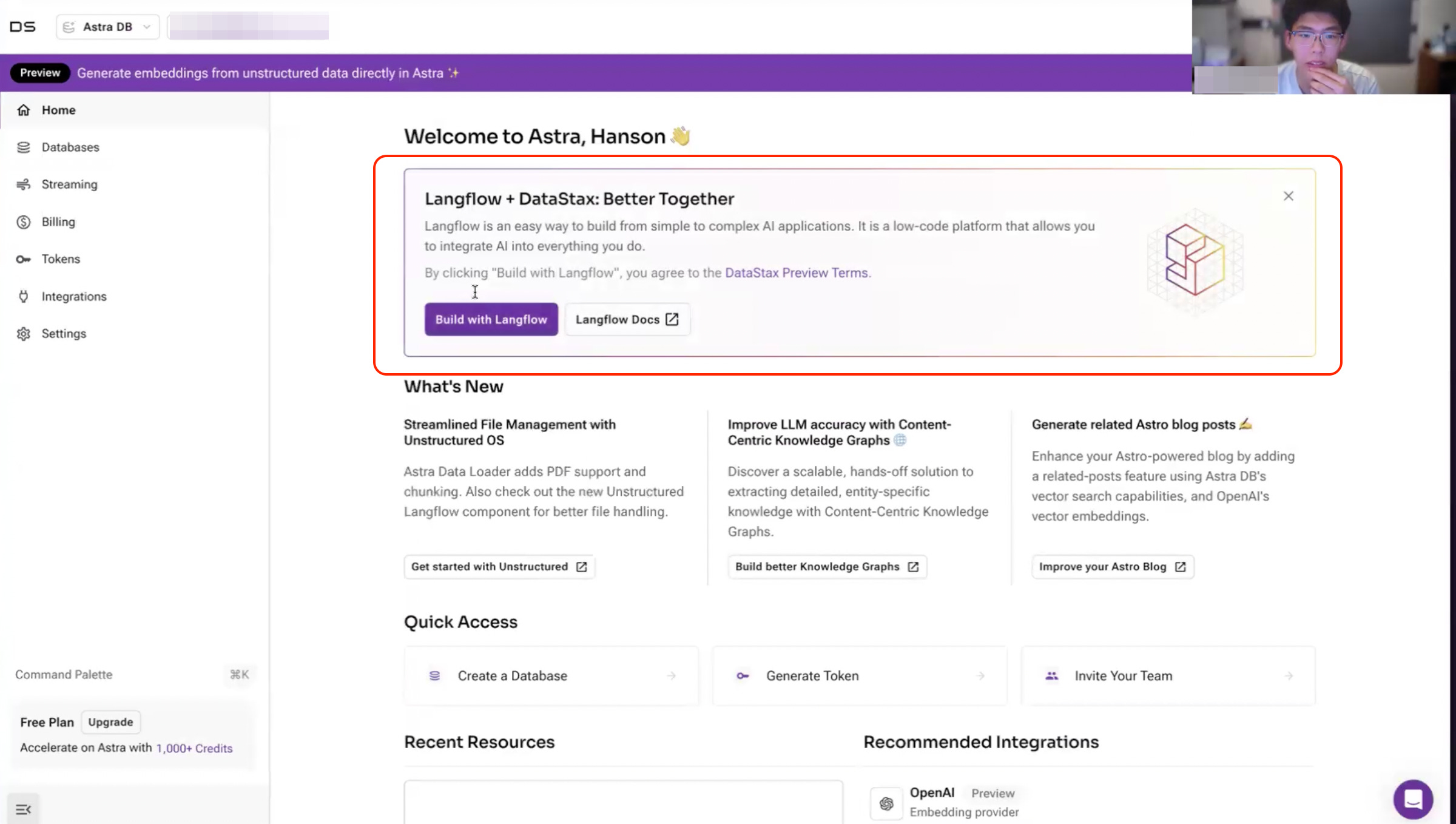
Hanson overlooked the "Build with Langflow" CTA because the boxed section with an X button gave the impression of an ad. The description of “Langflow + DataStax: Better Together” also contributed to this assumption. This example illustrates banner blindness, where users tend to overlook elements that look like ads. Dropping new Langflow users directly onto a screen focused on starting a new project would be ideal. This would help them get to the canvas quickly and reduce the risk of missing important CTAs.
Since this insight is based on a single participant, it's important to assess whether this issue is widespread. I would look into:
How many new users click on the "Build with Langflow" CTA that come from the Langflow website? Is this step a big drop off in the funnel?
If you run an experiment by simplifying the dashboard to focus solely on Langflow for new users coming from the Langflow website, does it improve conversion rates?
It might also be worth removing Astra content from the dashboard for new users coming from Langflow.org initially. A progressive onboarding approach—introducing Astra at the right time—could work well. For example, show Astra only after users have completed basic tasks like starting a flow/pipeline, especially when they might need it for complex projects or larger datasets.
Although this usability test only involved one participant, it revealed clear opportunities to improve Langflow’s onboarding. When we’re deeply involved in a product, it's easy to lose sight of what the experience is like for new users—this is why usability testing is so valuable. To showcase Langflow’s flexibility and customizability, it’s important to get users into the product quickly, and streamlining the onboarding process would make a significant difference.
Big thanks to Hanson for participating in this study and providing honest feedback. And thank you for reading! 💙
To learn more about the concepts mentioned here, check out NNg’s resources on tunnel vision and selective attention, banner blindness and the heuristic on maintaining consistency.